Local Bottle Shop
A bottle-cap mark for a Concord, NC bottle shop — beer-and-wine iconography playful enough for a growler, clean enough for an embroidered hat.
A graphic designer working across logo & brand identity, print collateral, and digital design — from a bottle-cap mark that had to survive a hat embroidery machine, to a fire-protection landing page built to bring in real leads, to a wedding invitation that had to feel like the first page of a love story.

I'm a graphic designer who likes the parts other people skip — the kerning, the exact Pantone, the flourish that makes something feel considered instead of generic. My work spans full brand systems for companies that needed a mark to hold up everywhere (a favicon, a hat, a fleet of trucks), the catalogs and campaigns that keep those brands running day to day, and stationery suites for couples who needed their invitation to feel like them.
Whatever the project, the goal is the same: make it feel less like a template, and more like it was made for exactly one thing.
15+ years of in-house creative experience, from strategy and UX through design, production, automation, and digital execution.
I've spent more than fifteen years growing from designer into Creative Services Supervisor at one organization — leading projects from concept through execution, juggling multiple priorities and stakeholders at once, and delegating work while staying hands-on enough to jump in myself when a deadline calls for it. I work daily with marketing, sales, e-commerce, and leadership to keep the brand consistent, and bring in outside vendors only when it actually makes sense to.
Design doesn't stop at the file — it lives inside a CMS, a campaign, or a storefront. I've managed content and design across multiple platforms, building pages with the structure, navigation, and hierarchy that actually work for the people using them, and designing email and landing page experiences that fit into a bigger customer journey rather than standing alone.
I move between design tools depending on what a project actually needs — the tool is never the point, the outcome is. That same instinct extends to automation and AI: I built Photoshop scripting to batch-process and resize large volumes of images for web use, replacing work that used to go to outside vendors, and I use AI to speed up early concepting and push toward stronger hero imagery and campaign visuals — while the creative direction stays mine.
None of this happens in isolation. The right platform, an automated production step, an AI-assisted concept round — they all trace back to the same goal: stronger creative output, delivered faster, with less reliance on outside vendors. It's freed my team to spend more time on the work that actually needs a person's judgment, and it's the kind of thinking that ties creative decisions directly to efficiency, campaign performance, and return on investment.
Creative leadership, technical knowledge, automation, and emerging technology add up to the same thing: stronger creative output, greater efficiency, and work that earns its place in the budget — not just the brand guide.
Marks built to hold up small — on a hat, a bottle cap, a favicon — and to still feel intentional at full size.
A bottle-cap mark for a Concord, NC bottle shop — beer-and-wine iconography playful enough for a growler, clean enough for an embroidered hat.

A circuit-inspired wordmark for an electronics supply company, built to scale from a tiny favicon up to a storefront sign.
A hand-lettered wordmark with a botanical roofline, designed for a home builder that wanted something warmer than the usual builder logo.

A confident, corporate mark balancing trust and clarity for a workplace safety consulting firm — built out into a full brand guide.
A playful, high-energy mark for a kitchen filtration brand, paired with a full style guide and a mascot that makes hood cleaning fun.
A bubbly, retro wordmark built as a flavor system — cherry, strawberry, lime, orange, and chocolate each get their own colorway across the product line.

My own mark — caREn, with the R circled like a stamp of approval on everything that leaves my desk.
Business cards designed to carry a brand's system into someone's hand — same palette, same voice, smaller canvas.

Alexander Cheney, Branch Manager

Jana Boatwright, Central Station Supervisor

Elegant gold monogram for a therapy practice
Everything from a wedding invitation kept for a lifetime, to a catalog cover, to a flyer people notice for one week and then act on.
Suites designed to be kept — not just opened once and set down.

Wedding invitation suite, hand-drawn botanical line art

Engagement party invitation, watercolor pine

Die-cut labels and supporting illustration for a flavor-driven edibles line, built to keep required warnings legible without losing the fun.
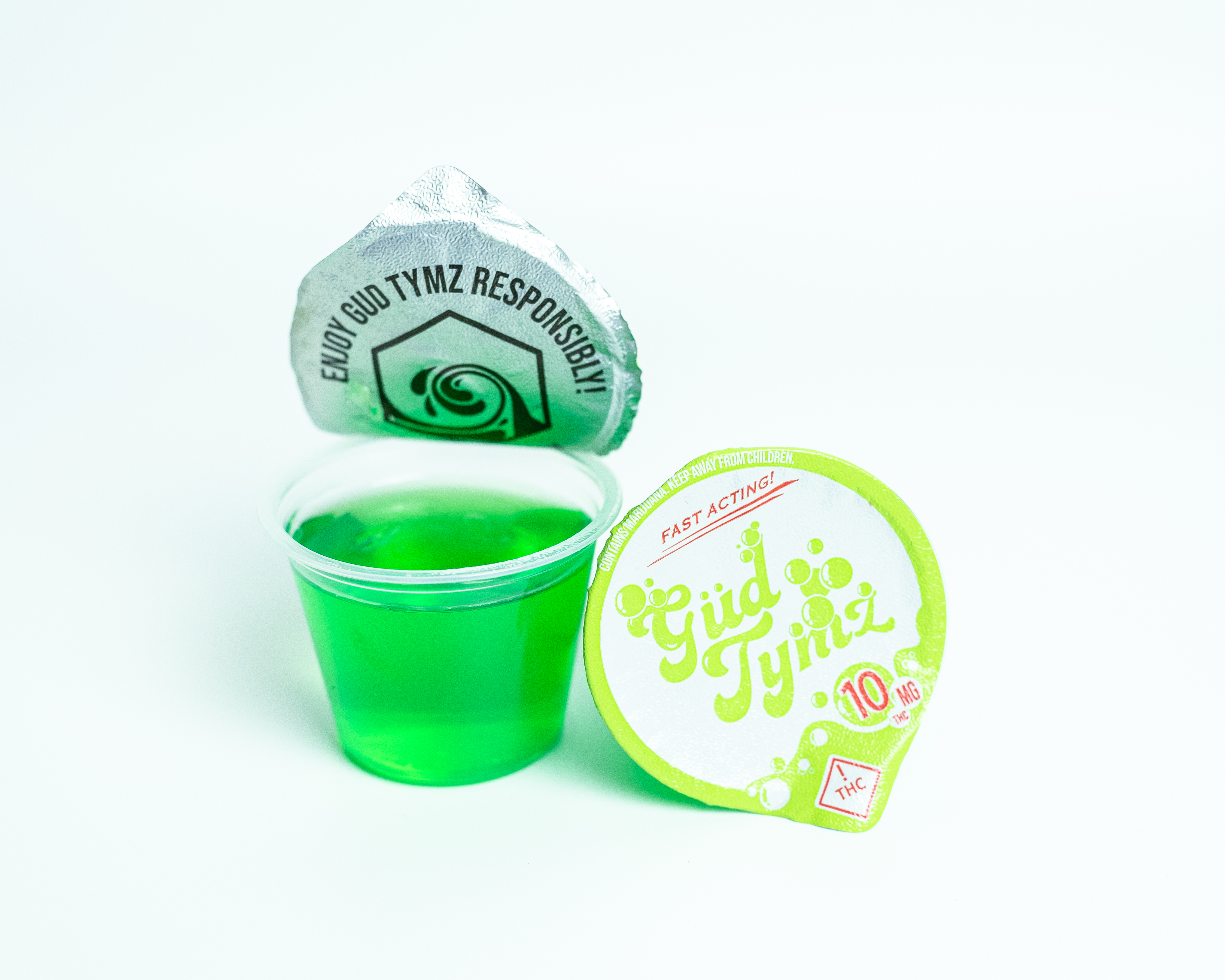
Teardrop die-cut labels with required dosage & warning copy
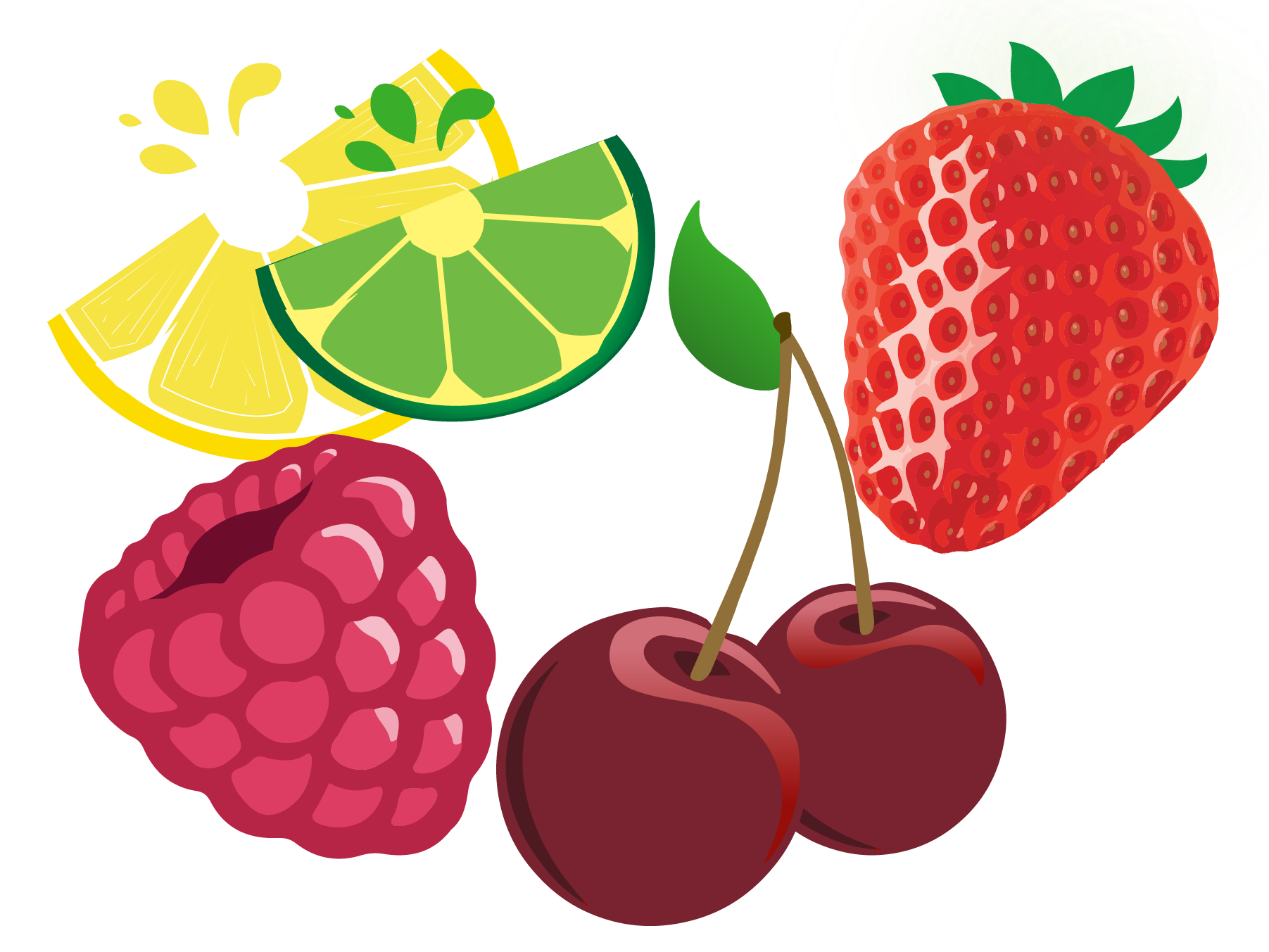
Custom vector fruit art supporting each flavor variant
Ongoing marketing work — catalogs, email campaigns, event flyers, and web banners.
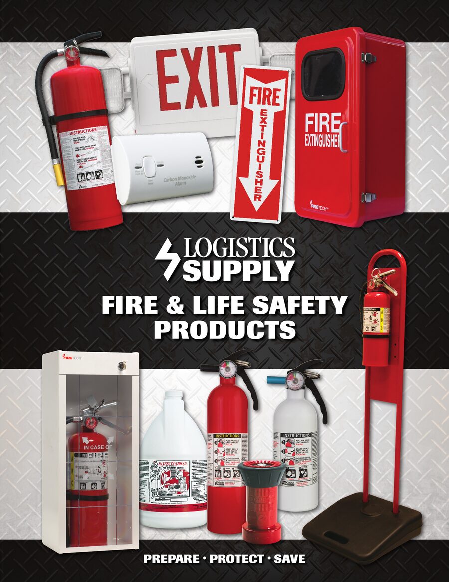
Logistics Supply — full product catalog cover

2025 course catalog, provided by Brooks
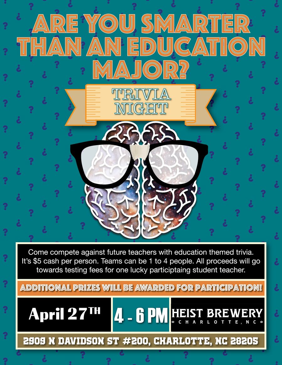
Event poster for a student-teacher benefit
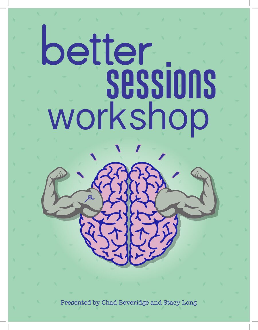
Workshop poster, illustrated icon lockup
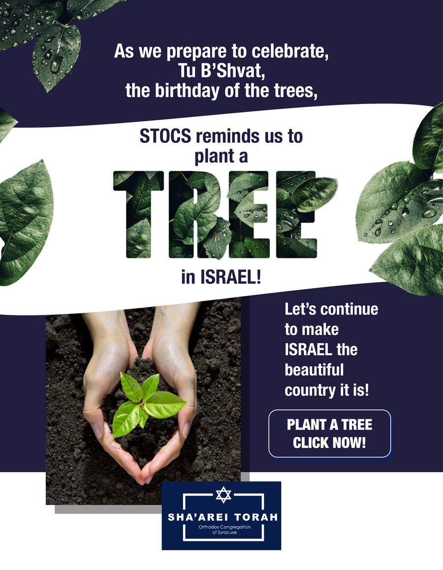
Holiday campaign for Sha'arei Torah congregation
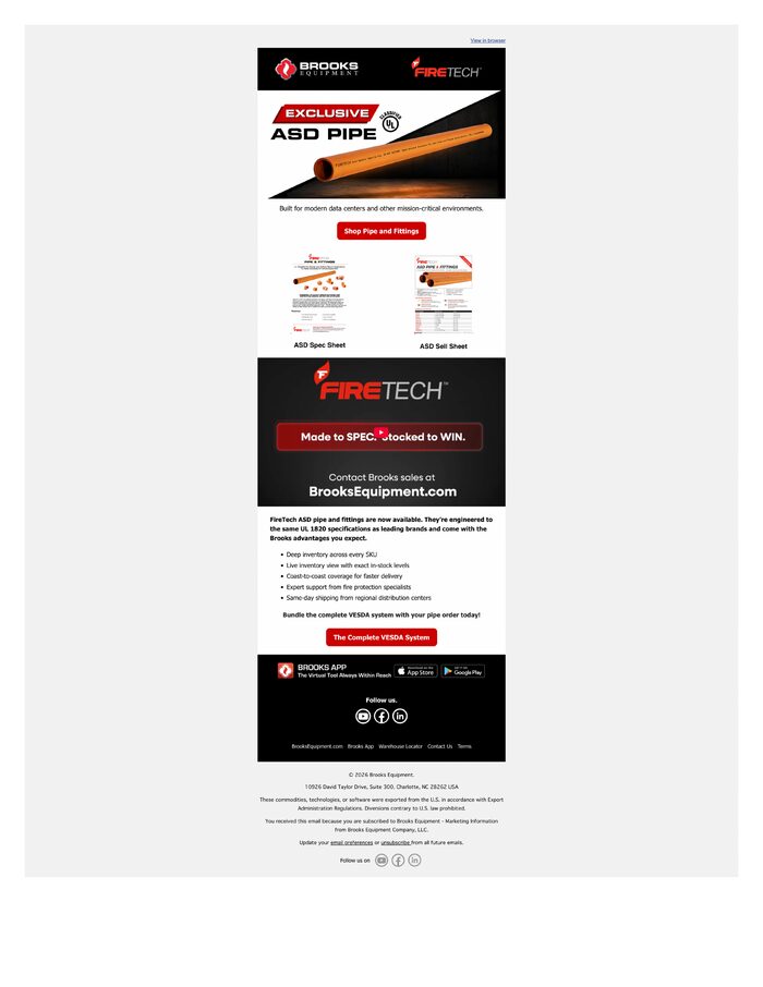
Product launch campaign for Brooks Equipment
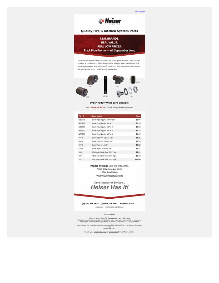
Monthly promo email with live pricing table
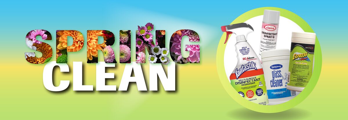
Seasonal promo banner, Logistics Supply
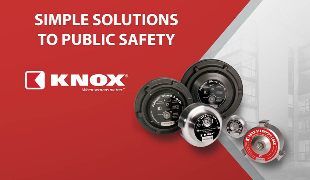
Web banner for public safety hardware
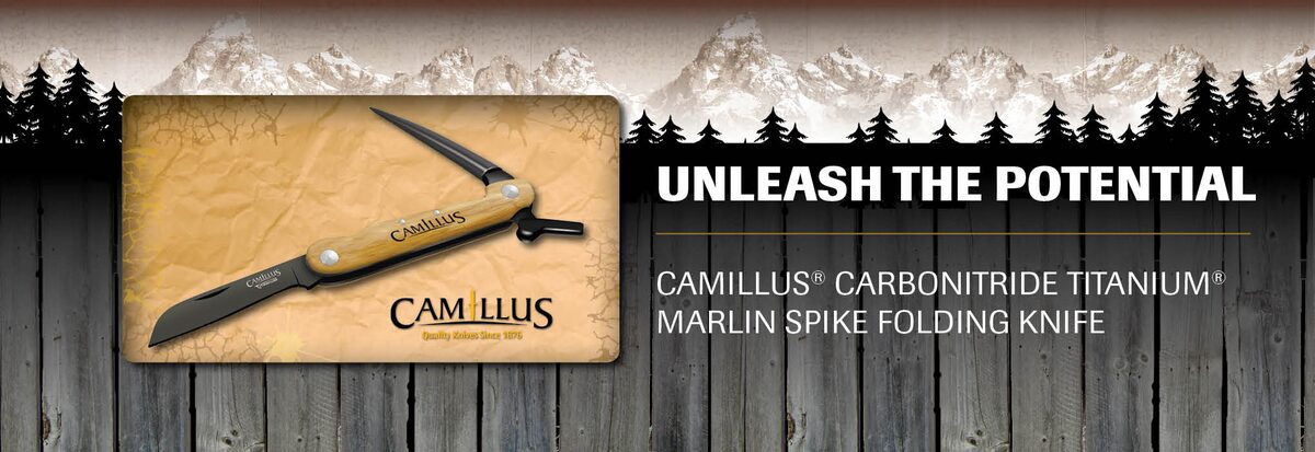
Web banner, outdoor lifestyle brand
Landing pages and brand pages designed to convert — built and shipped on real client sites.
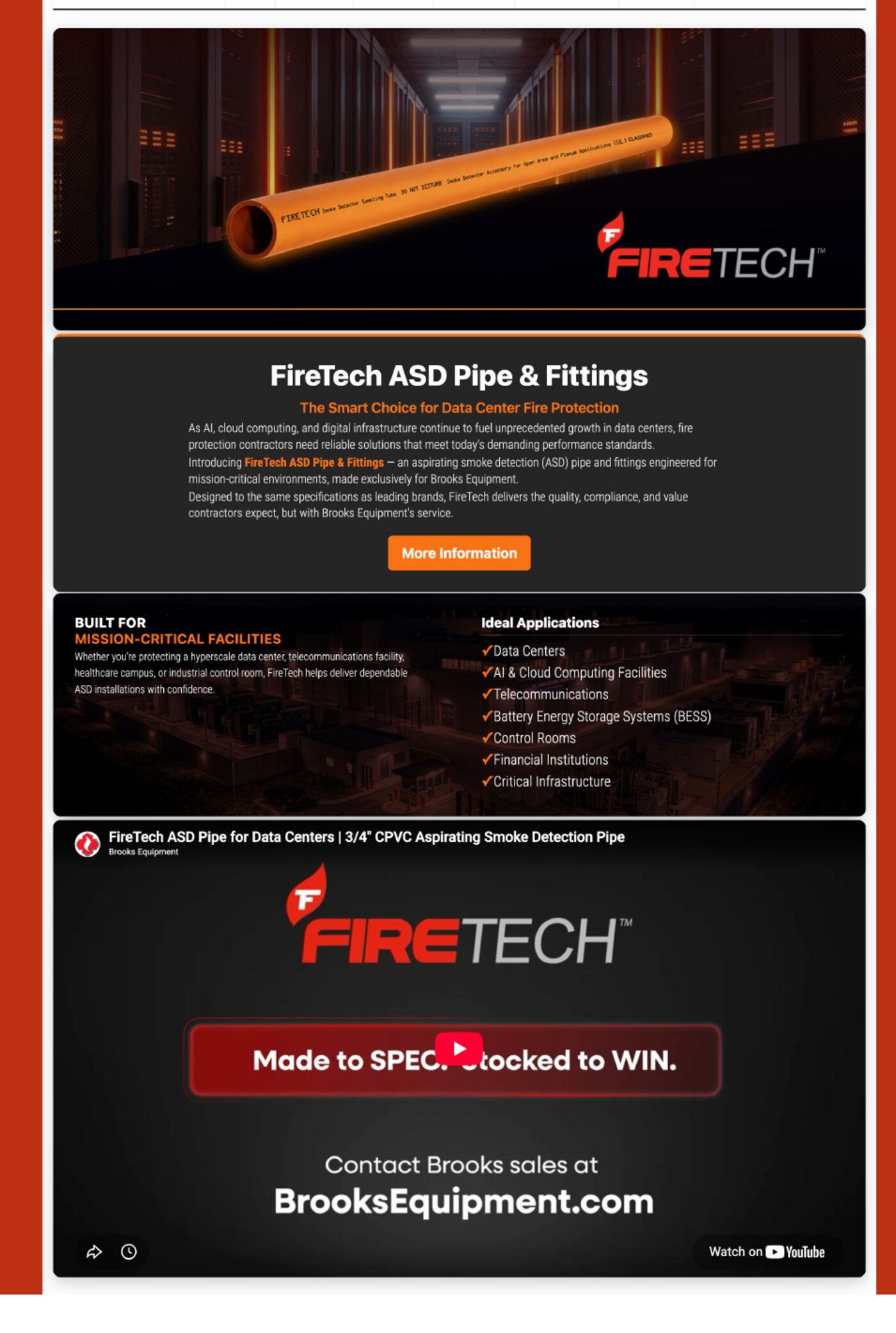
Product launch landing page for BrooksEquipment.com — hero, proof points, spec sheet feature, and a lead-gen contact form.
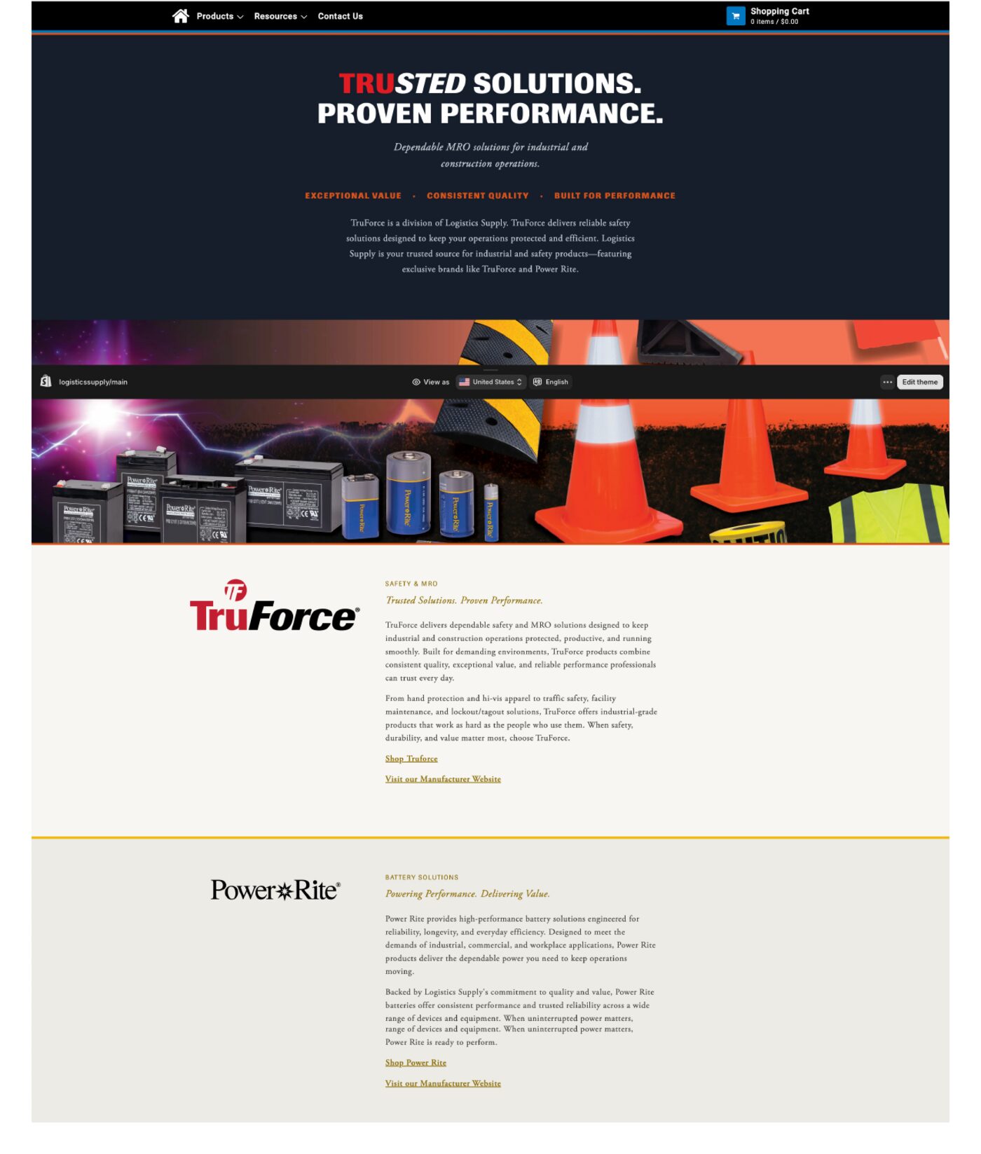
Brand showcase page introducing TruForce and Power Rite as exclusive product lines, with a bold hero and clean brand panels.
Full identity systems built to hold up across every touchpoint — logo lockups, color, typography, and usage rules documented so a brand stays consistent no matter who's using it next.
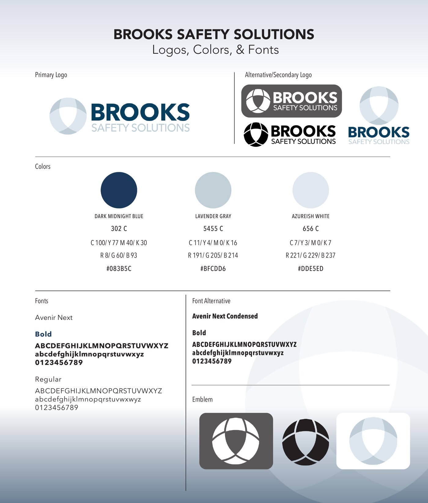
Logo lockups, color palette, and typography guide for the safety consulting brand
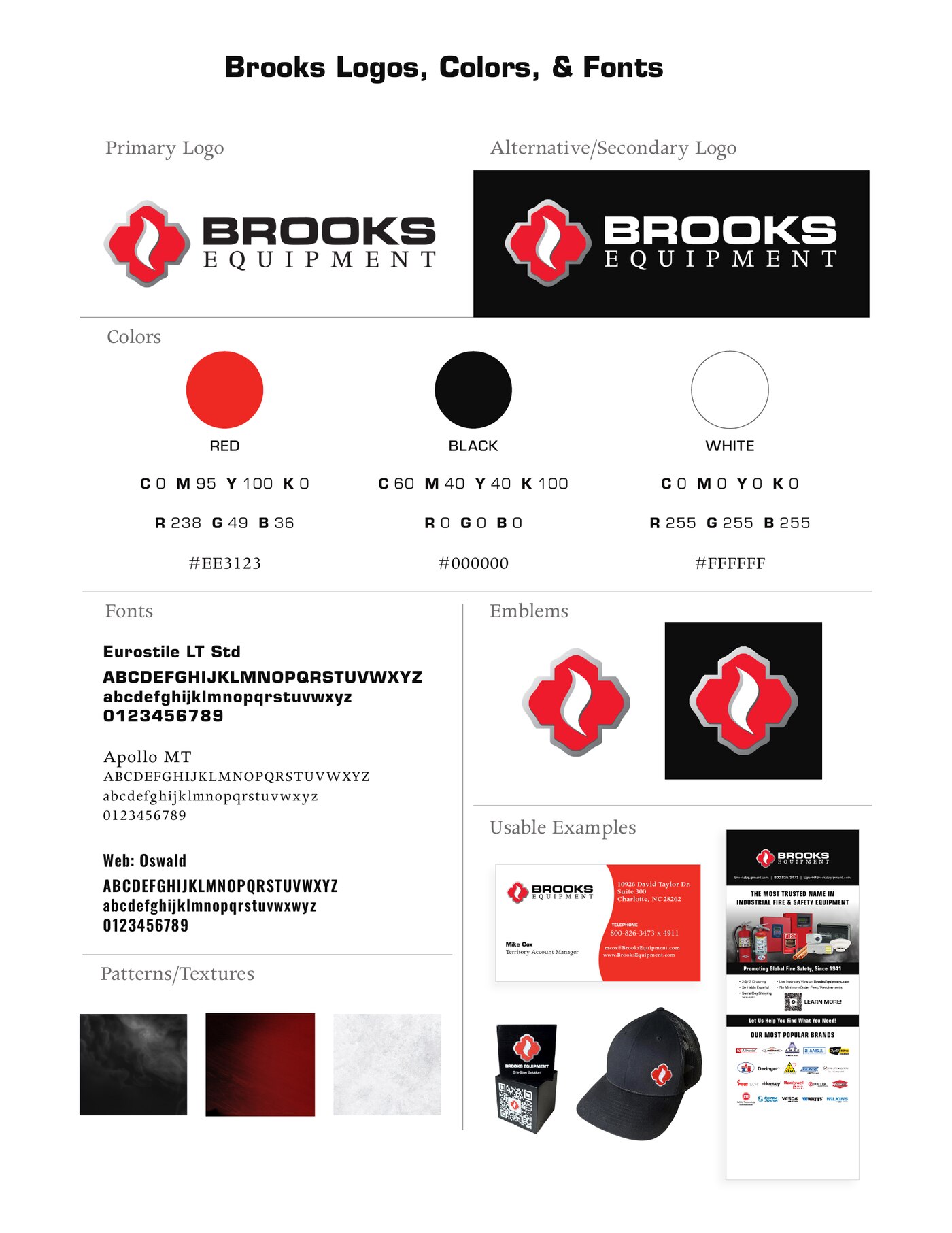
Full identity system including emblem marks, patterns, and real-world applications
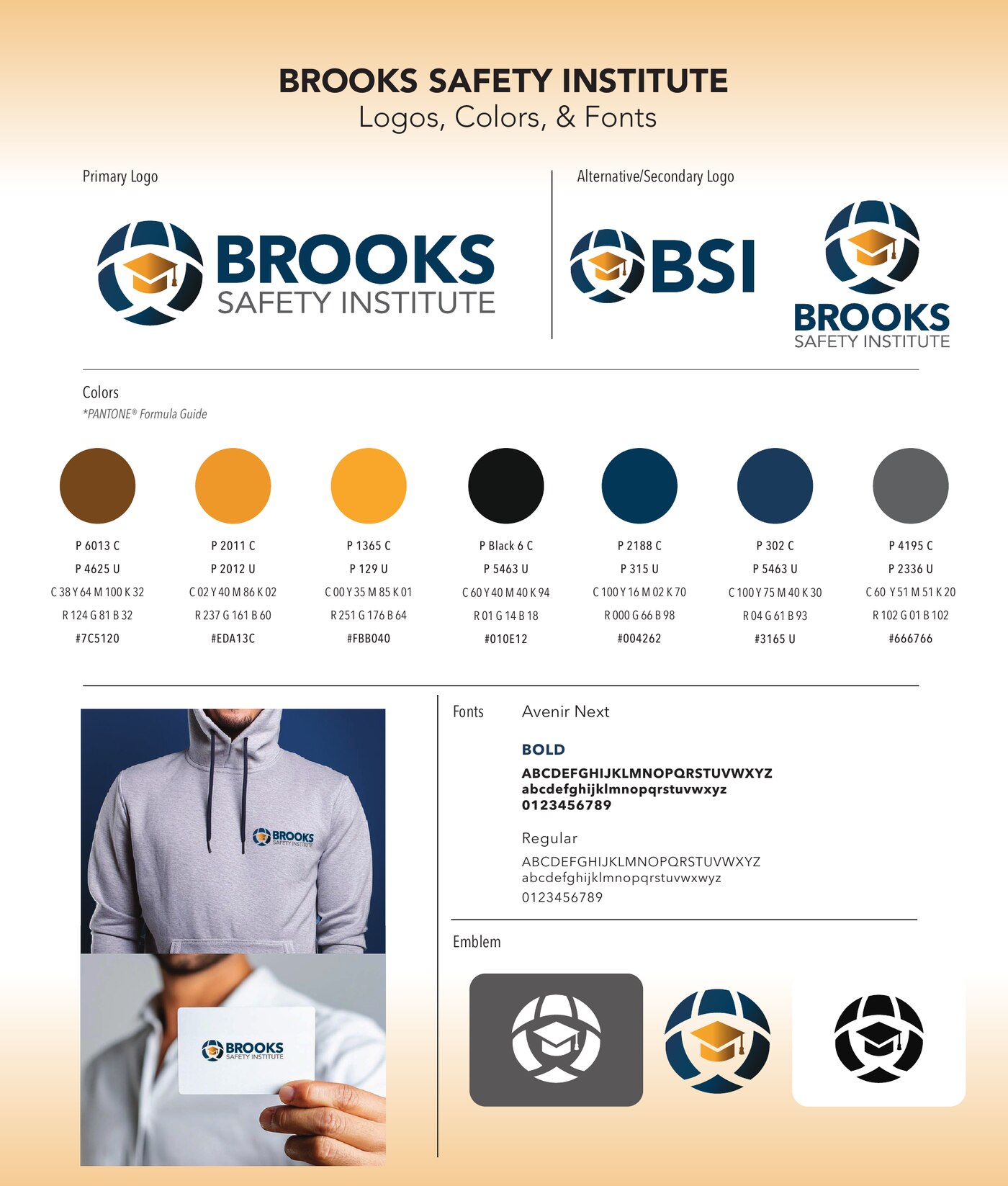
Identity system for the training & certification arm of the Brooks family of brands
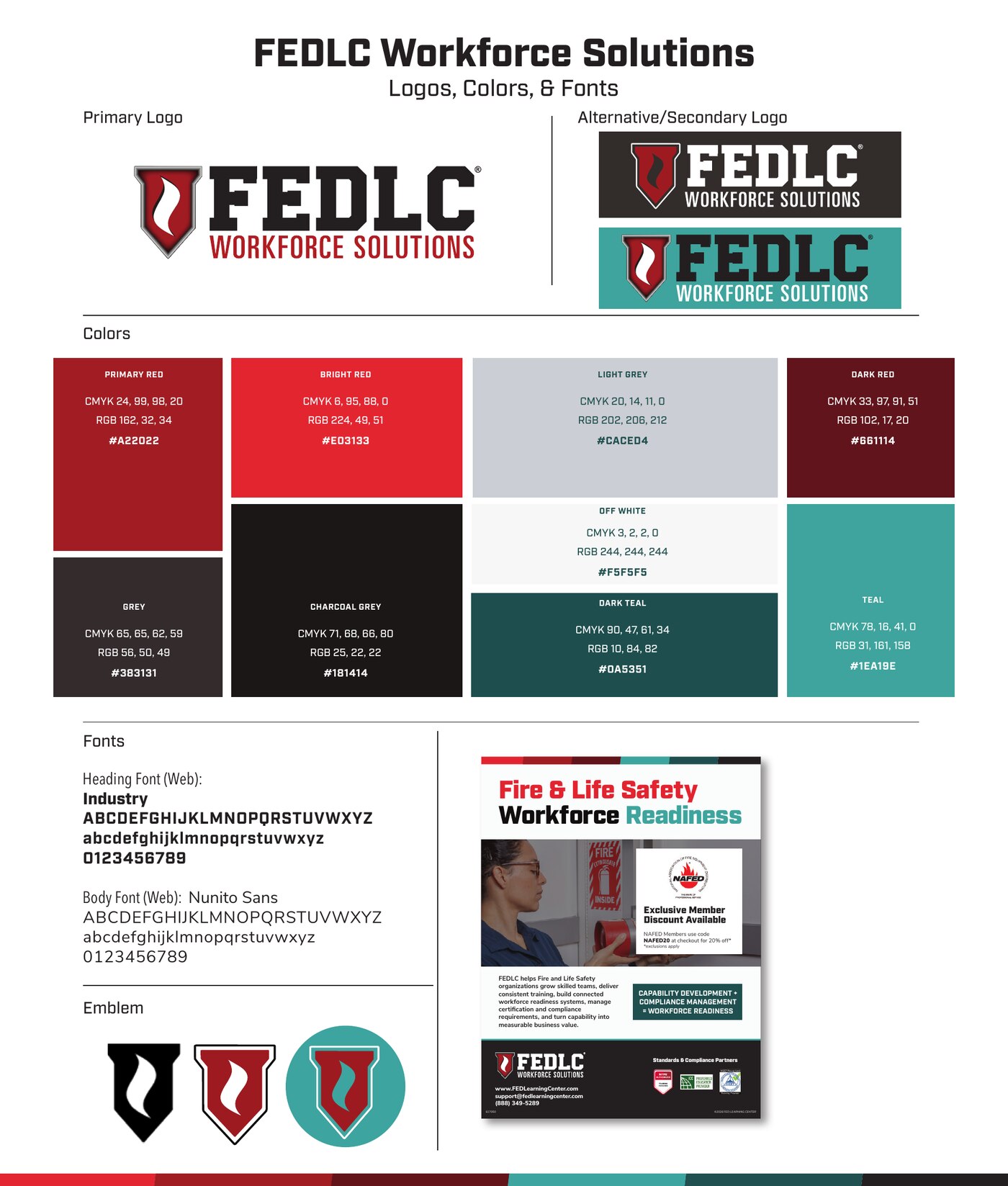
Bold, high-contrast identity built for a fire & life safety workforce training brand
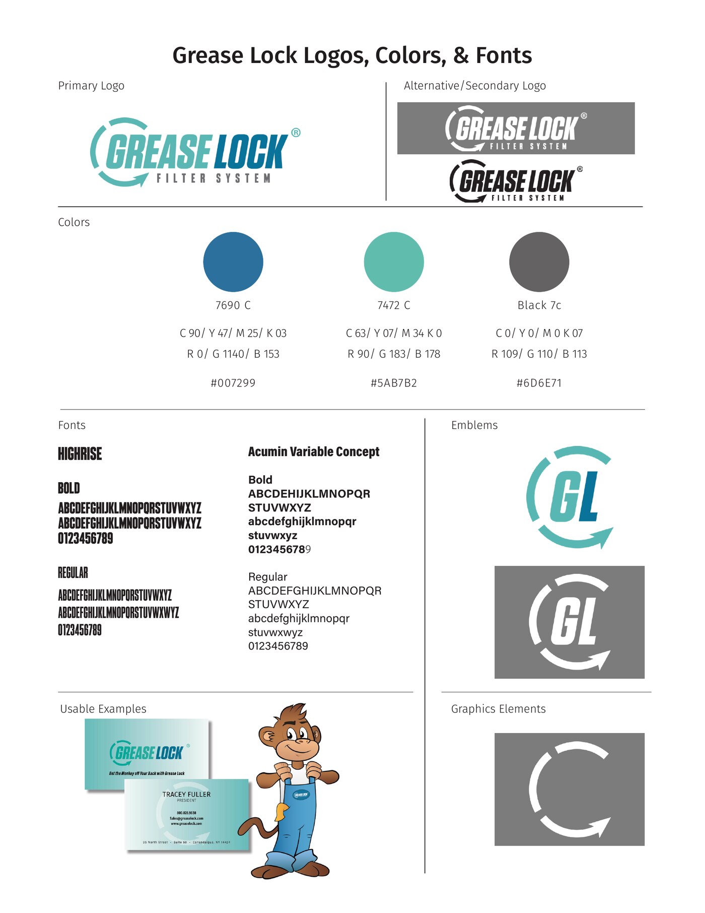
Playful, energetic identity system built around a memorable mascot and mark
Tell me a little about it — the timeline, the deliverables, the vibe — and I'll get back to you within a couple of days.